BRIZZ HOT SAUCE
Client: BRIZZ
Services: Brand Identity & Design, Packaging Design
View Project: Website
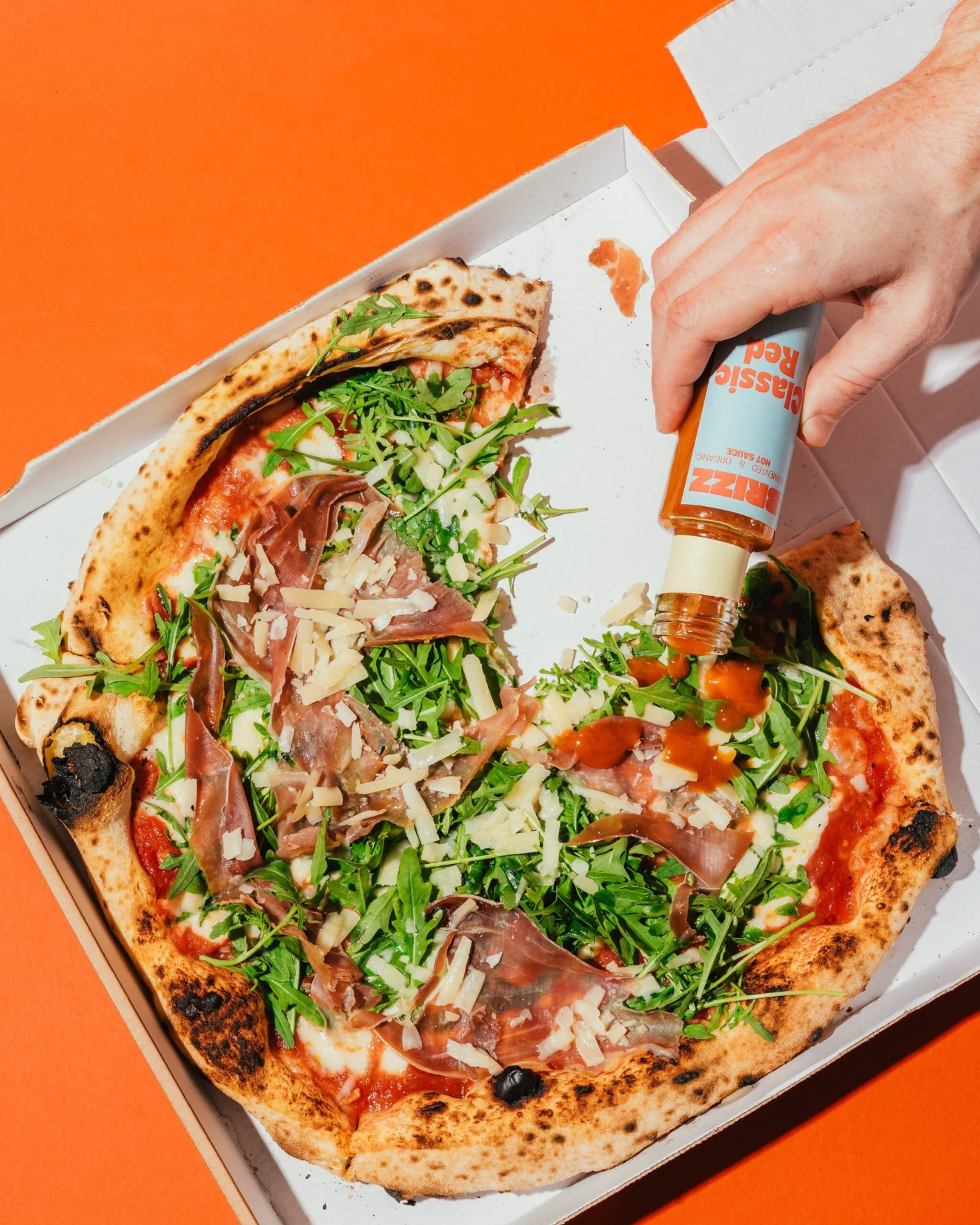
How do you launch a new hot sauce brand into a market full of interchangeable chilli products? By creating a brand that isn't just hot – but has flavour, attitude and character. BRIZZ is a new generation of hot sauces: organic, naturally fermented and full of umami. Inspired by Japanese fermentation cultures and produced in Austria, it delivers complex aromas instead of one-dimensional vinegar heat.
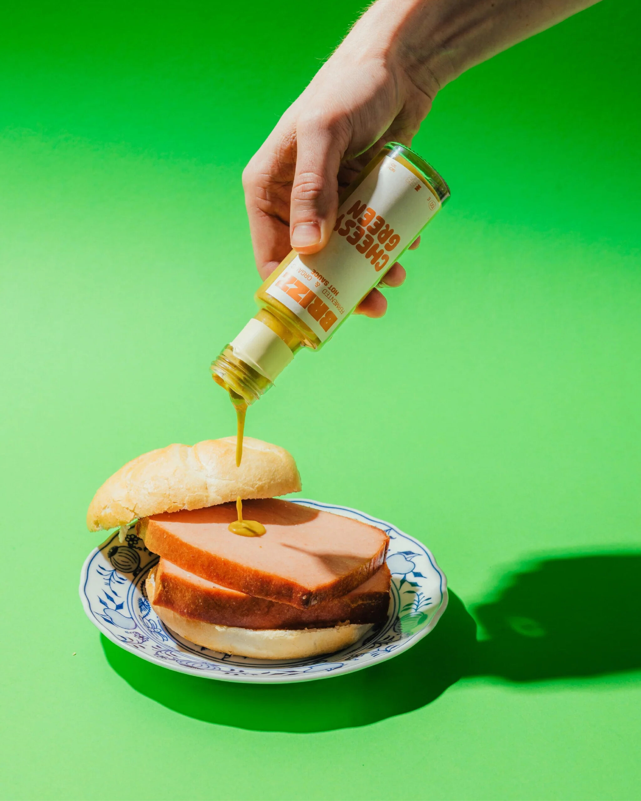
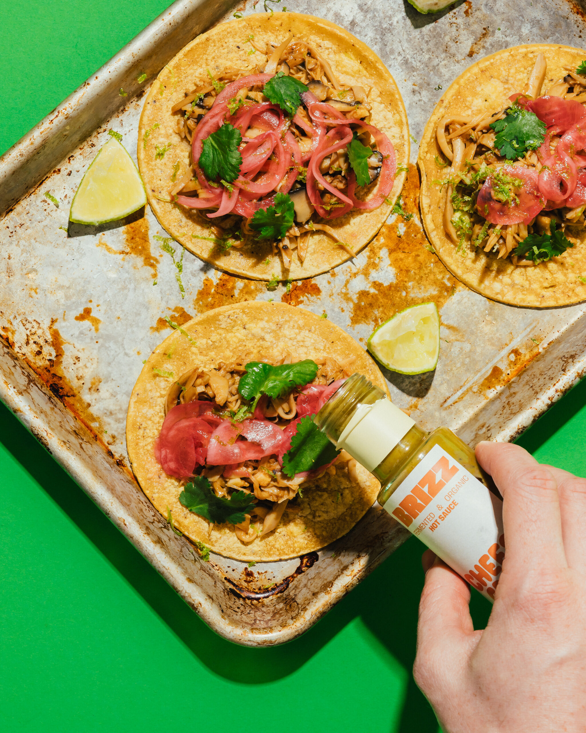
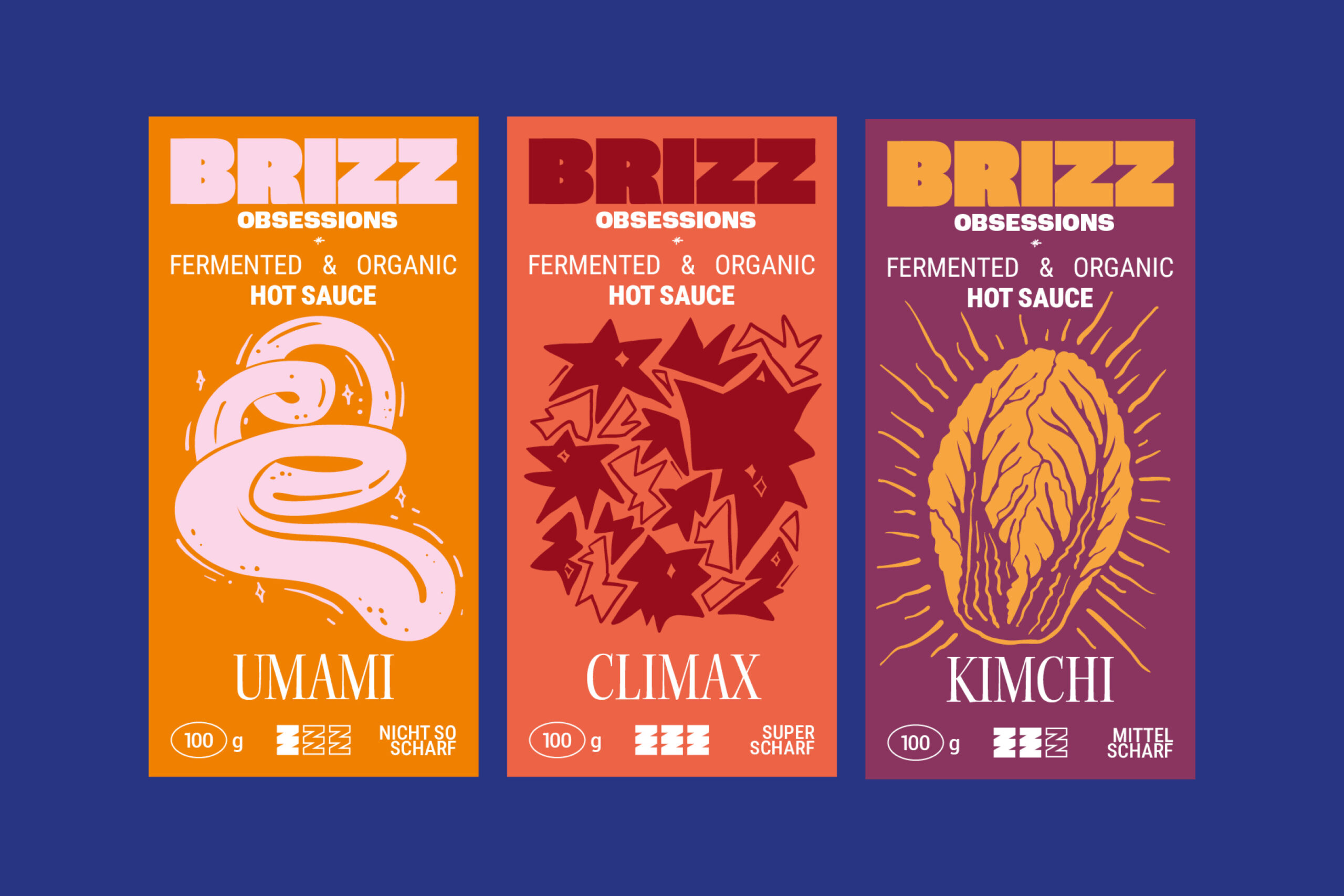
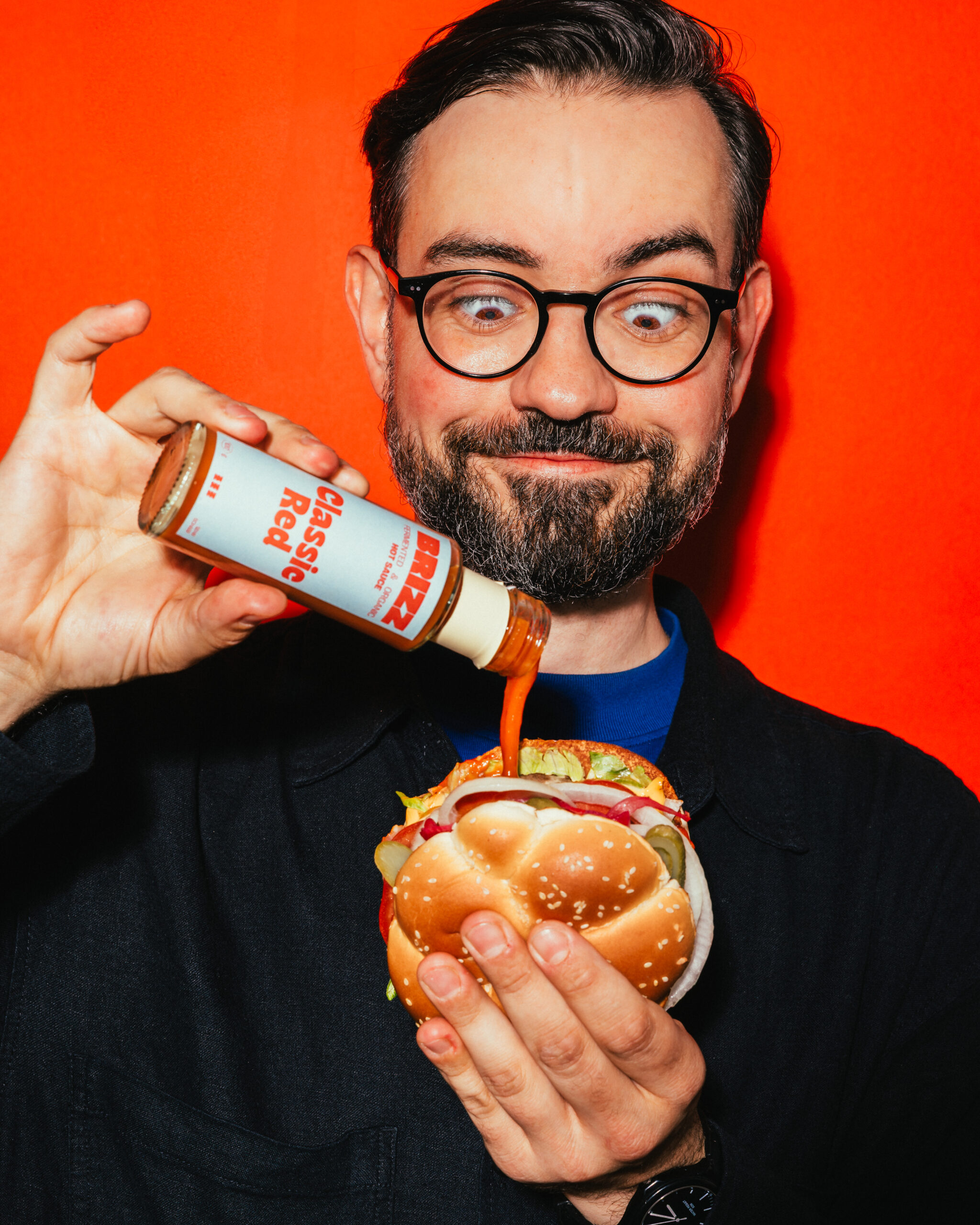
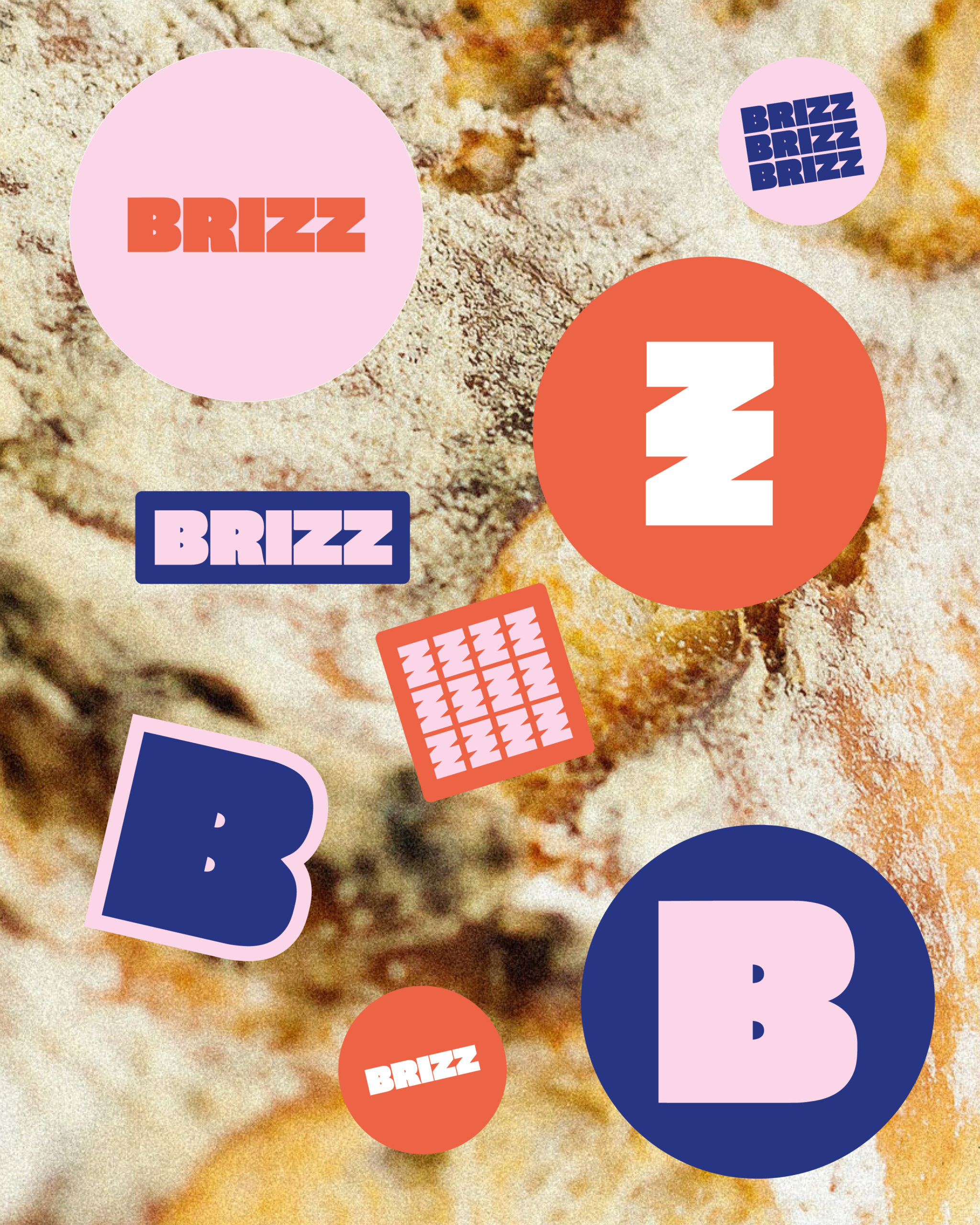
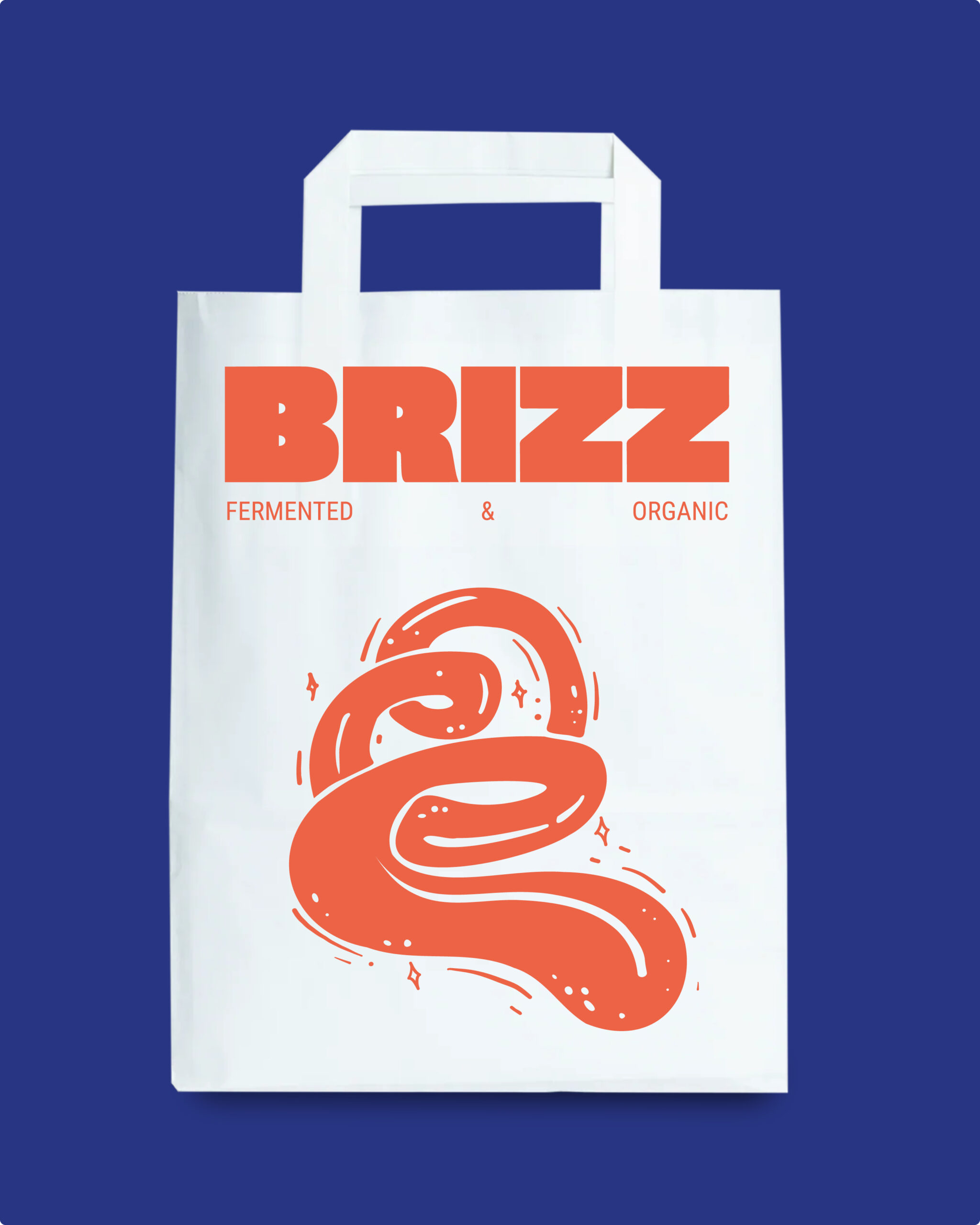
For BRIZZ we developed the entire brand universe – from strategic positioning to visual identity. The aim was a brand that stands out immediately on the shelf, works just as well digitally and translates a rebellious, contemporary fermentation culture into visual form. The result is bold branding with a clear tone of voice, strong colours and a visual language that brings together food, humour and heat.
The branding carries the philosophy of the brand: real fermentation, high-quality organic ingredients and uncompromising flavour. The sauces are made from natural ingredients and ferment for weeks, developing depth and umami rather than relying on artificial additives or a dominant vinegar note.
On this foundation, BRIZZ is positioned as a modern gourmet hot sauce – loud, cheeky and with a clear stance against bland industrial sauces.